
Problem
One of my first design positions was at a company called Mojio. At Mojio, I helped launch Mojio Motion, an app that paired with an IoT device that plugged into user’s cars and allowed them to remotely track their vehicle, check their gas levels, review their maintenance schedule, and more. Following the success of our MVP app, the company saw an opportunity for us to expand our offering beyond tracking the user’s vehicle and offer users more services—such as roadside assistance, a gas station finder, and parking services.
This re-architecture effort also provided us with an opportunity to holistically re-evaluate the app and incorporate feedback from our 100k+ user base. The result of my work would ultimately see our App Store rating increase from 3.5 to 4.7 stars.
Explorations
Many of the features we were interested in introducing, such as a virtual glovebox, roadside assistance, and a gas finder—were complex enough that they already had whole apps devoted to them. We would need to re-prioritize all features in the UX to prevent the experience from becoming unwieldy.
The existing Motion app constantly showed information on items such as the car’s battery even though batteries fail very rarely. One of the big changes this project would bring about would be an effort to only show information contextually—I only need to think about my battery if there is an issue with it.
Several of my early explorations are shown below, with pros and cons to each approach.
The Good Location of vehicle and fuel is displayed prominently. It’s clear that there are more things you can do from the card.
The Bad Visually cluttered, too many options. Items that are tapped rarely, like engine and battery issues, have high prominence.
The Good Important issues that the user needs to know about are shown in a dedicated place and can get the user’s attention.
The Bad Visually it is still heavy, still too many options. I had dropped fuel in this revision, which really was a blow to this approach.
The Good Prominently features vehicle location, fuel status. Map occupies more real estate than previous versions. Feels lighter.
The Bad I realized here that the dial for switching between car detail, parking, gas, and navigation modes was never going to work. I had to integrate all these things in a more fluid way.

Final Design
After several iterations and user feedback, I arrived at the design on the left. This version, capturing the best elements of the above, provide the same features and value as our existing app, but captured all in one screen.
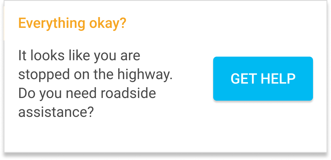
One of the most key elements here was the introduction of what I termed “context cards.” Context cards are status updates that are surfaced to the user when we believe there is an issue worthy of the user’s attention. If the user’s vehicle had a low battery, we could surface a context card indicating that they should get it checked out—but if their battery was fine, we did not need to burden them with unnecessary information.
Context cards gave us a lot more freedom to explore new options and ways to interact with our users.
Context Card Examples


Vehicle Drill-Downs
Although the new home screen was designed to meet most of user’s requirements and needs, we needed to provide an alternative way to access deeper and less frequently used features. If the user wanted to access other features, such as their Car Overview or Car Timeline, they could pull up on the drawer to drill down into the selected vehicle. This would place them into the Car Overview section, and from here they could use the bottom navigation to jump to different functions of the app which all pertained to the selected car.

Car Timeline
A final area that saw significant changes and improvements was the “Trip History” section of the app. In the original Motion, we had two separate sections—Trip History and Notifications. We found there was duplicated functionality between notifications and trip history, such as trip start and trip complete notifications. Additionally, some notifications, such as a DTC (Diagnostic Troubleshooting Code) occurred during trips. Being able to map issues directly to the trip in which they occurred provided very useful context when it came to diagnosing an issue or problem.
The result of this was the Car Timeline, which merged all events together in a way that told the user their car’s story.
Results
Side-by-side comparison between the MVP home screen and the final home screen mock design.

I delivered to Mojio a completed app for both iOS and Android. I departed Mojio before these designs shipped to the product, and naturally, there were some additional changes made over the course of the next year. However the majority of my approach and thinking remained intact.
White-labeled versions of this product with my design work have shipped in the US as T-Mobile SyncUp Drive (4.7 stars on the App Store) and MetroSmart Ride (4.8 stars on the App Store).
T-Mobile SyncUp Drive My designs as they were ultimately implemented in our white labeled product for T-Mobile.