What is Calendly?
Calendly is a popular online scheduling tool. Meeting hosts provide their availability to Calendly, and Calendly creates a scheduling page that can be shared to people they want to meet with. The scheduling page only provides times that work for the host, so once the invitee selects a time, the meeting is booked with no need to go back and forth.
Want to give it a try? Book some time to chat with me

Background
During my time at Calendly, I focused on enhancing the native mobile app. Initially seen as a companion to the web experience, it was more of a 'lite' version, lacking key features and purpose that utilized its mobile capabilities.
Surveys showed that about 50% of our users needed to use Calendly on-the-go. We aimed for 25% of our users to use the mobile apps, but only 10% did at the time I joined, which is far below our goals.
Calendly’s mobile apps in 2021 when I joined

Upon starting work on the mobile apps, I saw that the visual design didn’t align with the Calendly brand and lacked internal consistency. Key elements, like event types, were cluttered with CTAs and varied fonts, complicating user interpretation and decision-making. These were surface issues, however; to enhance the experience, I needed to study how users were engaging with the app.
Key Observations
The data showed that mobile users interacted with the product differently than web users. Notably, they spent a lot of time in the scheduled events section, which was simple and lacked features compared to a full calendar app. We also found that many hosts were scheduling meetings through their own booking pages, which was unexpected since Calendly's model focused on sharing links.
Example of a host booking a meeting through the booking page preview
Users were reaching their booking page in the app using an unusual method. They accessed it through a preview feature, so it was essentially a hack. But what really got our team’s attention was how often users were doing this: 1 in 5 Calendly meetings were being booked this way.
Interviews and survey results
We surveyed mobile users after noting surprising feature usage to identify what was going well but also what we needed to improve upon.
Areas of dissatisfaction
"It's confusing that certain things can only be found in certain tabs." - Support user
"It is difficult to access a past scheduled contact's information on the mobile app." - Sales user
"The app is just not as user friendly." - Recruiting user
"It's confusing that certain things can only be found in certain tabs." - Support user "It is difficult to access a past scheduled contact's information on the mobile app." - Sales user "The app is just not as user friendly." - Recruiting user
Users cited difficulties navigating the app and locating certain features (esp. availability). Some users found the process of updating global availability in the app cumbersome. They expressed frustrations around getting redirected to mobile web to complete certain tasks (some users found mobile web sluggish and outdated).
Strengths of real-time meeting management in mobile
"I can schedule follow-ups on the spot so I don't have to worry about forgetting." - Sales user
"The app makes it easy for me to quickly look at what I have coming up and know when I'm going to be available." - Sales user
"I'm very happy with how fast (scheduling a new meeting) can be done." - Recruiting user
"I can schedule follow-ups on the spot so I don't have to worry about forgetting." - Sales user "The app makes it easy for me to quickly look at what I have coming up and know when I'm going to be available." - Sales user "I'm very happy with how fast (scheduling a new meeting) can be done." - Recruiting user
58% of users agreed that the mobile app helps them to manage meetings in real-time. Users mentioned two different use cases:
Users said booking a follow up meeting while in the meeting makes a good impression on invitees and keeps them from forgetting to share/book afterwards. Users who shared links in the meeting spoke of similar benefits.
Users also mentioned using the app to check and manage their schedules. Users wanted to know what was coming next and to be able to quickly modify their schedules if a meeting was running over.
While there were no mentions of screen sharing specifically (ie. screen sharing a host’s availability to an invitee), there was a sense that it was quicker and less disruptive to use the app while in a meeting.
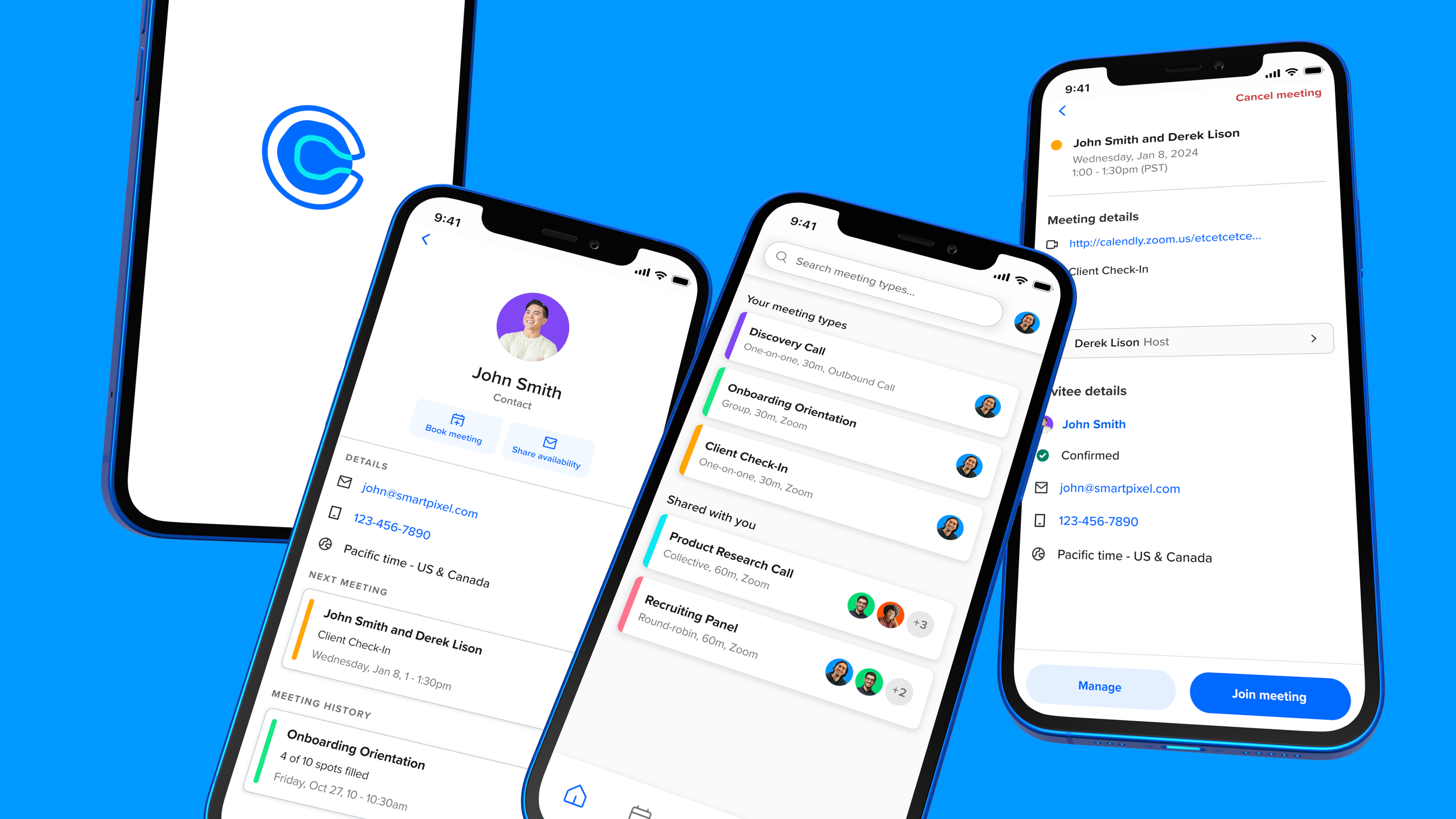
New App Experiences
Our research showed that the app needed a lot of work to make it easier for users to traverse and to focus on managing scheduled events. By the end of the project, almost every screen in the app would be redesigned.
Videos walkthroughs


Project Results
Most features mentioned were released in late summer 2024, with positive initial results. The summer bundle, which included updates for contacts, scheduled events, and real-time scheduling, significantly boosted traffic to the scheduled events tab. We observed notable increases in daily active users, app sessions, and app adoption. We also launched In-App Purchases, leading to unexpectedly high revenue from the mobile app. As always, there's still room for improvement. About half of our mobile users engage only through the app, mostly solopreneurs, providing a solid base for product development as we move into 2025.